 Loading... Please wait...
- Home
- About Us
- Brands Search
- Help Center
- Enquiry
-
Products Catalogue
- Mont Marte Acrylic Colours 1L/2L
- Kusakabe Aqyla Colors
- Kusakabe Water Colors
- Kusakabe Oil Colors
- Kusakabe FUJIART COLOR
- Copic Marker
- Full Line Catalog
- Pantone Trend Forecast
- Pantone Graphic Design
- Pantone Fashion Design
- Pantone Product Design
- Molotow Coversall Water Based-358000
- Molotow Premium -327000
- Molotow Flame Blue Neon -557499
 Keywords
Welcome to use PayPal
Categories
Popular Brands
- Home
- Help Center
- Pantone Matching System (PMS)
Pantone Matching System (PMS)

Pantone Color Systems – For Graphic Design
If You Work In Print, Packaging, or Digital Design, You’re in the Right Place!
An Array of Color Options in Solid and Process
You’ve probably heard the word PMS, which stands for the Pantone Matching System, a proprietary numbering system for colors used in graphic design. Did you know the Pantone Matching System includes both solid and process colors?
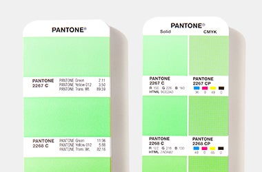
- Solid colors (sometimes call spot colors) are the truest representation of color intent in graphic arts. Solid color printing, also known as spot printing or offset printing, is the process by which a single color is formulated and then applied through print.
- Process colors utilize a limited number of inks, such as cyan, magenta, yellow and black (CMYK), applied in different ratios to create a variety of colors. Process colors are generally used when color accuracy or range is less critical.
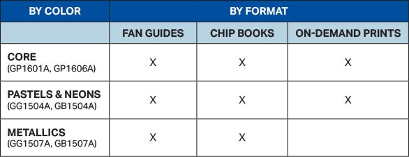
We have 3,026 solid colors, available in the following formats:
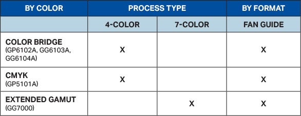
We have 6,732 process colors, available in the following formats:
Top Selling Graphics Products
Digital Solutions For Graphics

Your Pantone Colors, Everywhere.
Pantone Connect is a digital platform providing designers, producers, and brand managers exclusive access to over 15,000 Pantone Colors – every Pantone Color in every Pantone Library! Packed with helpful tools to build, share, and save smart palettes, Pantone Connect inspires creativity and ensures consistency and accuracy in branding, fashion, and product design. Most importantly, it’s now the only way to bring all your market-relevant, in-demand Pantone Colors into your design workflow for use in your Adobe® design programs.
Frequently Asked Questions
1: HOW DOES PANTONE CHOOSE THE PAPER FOR THE GUIDES?
We print our colors on the most commonly used, globally available paper stocks. Our coated guide is #1 grade 100lb gloss text stock (148 g/m2) and the uncoated guide is premium grade 80lb text stock (118 g/m2).
2: WHAT IS THE DIFFERENCE BETWEEN COATED (C) AND UNCOATED (U)?
PMS colors marked with a C mean that the color is printed on coated paper for a glossy finish, as you would see in a magazine. This is desirable for sharp and complex designs, as the ink stays on top of the paper, preventing bleeding. Likewise, a U indicates uncoated paper, which has a more porous finish, common on letterhead. Uncoated paper is generally more absorbent of ink than coated, reducing sharpness.
3: WHAT'S THE DIFFERENCE BETWEEN SPOT PRINTING AND PROCESS PRINTING?
Understanding the difference between spot and process is incredibly important in setting color expectations from design intention to production and when transitioning from a computer screen to the printing press. Solid color printing, also known as spot or offset, uses ink mixed to a precise formulation, resulting in more precise colors and allowing for bold, vibrant colors.
Alternatively, process printing is a method of printing colors using Cyan, Magenta, Yellow and Black (CMYK). In Extended Gamut printing, another form of process printing, Orange, Green, and Violet are added to the CMYK process to expand the color range.
4: WHY SHOULD YOU UPDATE YOUR PANTONE GUIDES & BOOKS?
Handling, light, humidity, and paper aging will cause colors to become inaccurate and you could be missing the latest market and trend driven colors. How many colors are you missing? Learn more here
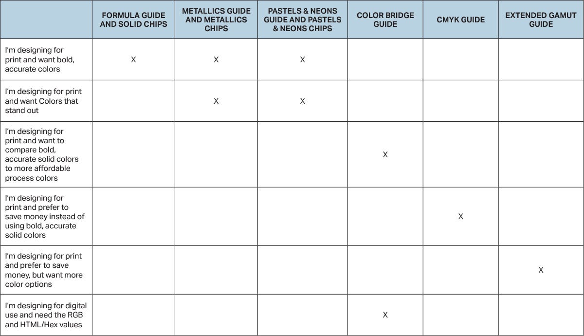
5: WHICH GUIDE IS RIGHT FOR ME?
Current Top Sellers
-
1
-
2
-
3
-
4
-
5
New Products
-
HKD80.00
-
HKD110.00
-
HKD260.00
-
HKD260.00
-
HKD160.00
Popular Products
-
HKD130.00
-
HKD8,410.00HKD7,569.00


